OHIO’s Oscar Fernández creates book including students’ research in layered history of letter forms
Image
Daniel King
Oscar Fernandez visited the Type Shop in Seigfred Hall in the fall of 2019, exploring a growing library of wood and metal type forms commonly used in Printing presses used by students, faculty, and visiting artists.
Ohio University instructor of Graphic Design Oscar Fernández in the School of Art & Design found a way to preserve the research gathered by his students last spring on the layered history of letter forms through his new book, Letter Portraits: Observations by Student Letter Anatomists.
Image
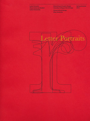
The cover of Oscar Fernández's Letter Portraits: Observations by Student Letter Anatomists. Photo by Daniel J. King.
The book consists of 37 OHIO students and nine Columbus College of Art and Design (CCAD) students, where Fernández also teaches, showcasing their graphic design skills and collective understanding of typography.
“I wanted the book to be a gift of sorts to my students, so I decided, why not make it a surprise?” Fernández said. “The students knew I was up to something, but they didn’t realize it would be to this extent.”
Fernández started the project by first assigning each student a different letter of the alphabet, a Roman numeral, or a special character. Both the OHIO and CCAD students researched five different classifications for each typographic mark: Old Style, Transitional, Modern, Egyptian, and Contemporary. Then they took their research and created design files, layering the outlines of all five types.
“My inspiration for overlaying letters came from a book I received as a graduate design student at Yale some 45 years ago,” Fernández added. “In one of my first classes, the legendary graphic designer Bradbury Thompson gave out copies of the classic work An Atlas of Typeforms in which typographic marks are also overlaid. Thompson then told us to read it and come back to class ready to discuss what interested us. For me it was ‘e’s,’ I was so amazed to be looking at 500 years of changes in one image.”
He said in that moment he knew he needed to do this one day and expressed the wonder it has brought him to act as a “quiet conservator of humankind’s greatest invention: writing.”
Fernández sees his book as a way of preserving and passing down that legacy. By also choosing to make the book about students at two different institutions, Fernández emphasizes how knowledge sharing is so important to the graphic design field. During the semester, even though Fernández didn’t tell students about his book plans, he did regularly share with his OHIO class what his CCAD students had designed and vice-versa.
Besides the student design work, Letter Portraits includes an introductory essay from Fernández that describes the “special honor” of being a graphic designer, as well as quotes from seminal historical graphic designers such as Thompson and the pioneering designer Beatrice Warde; real life illustrations of typography, such as photographs of Trajan’s Column; and insightful quotes from student papers on the nature of typography.
Image
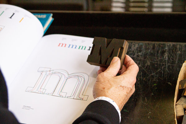
Oscar Fernández holds a wood block letterform in the Type Shop printing space in Seigfred Hall, as a way of comparison to the layered history of the same letter in his book, revealing the minor variations now visible through hundreds of years of design adjustments. Photo by Daniel J. King
Fernández credits Art Director for Advancement in OHIO’s University Communications and Marketing Sarah McDowell (B.F.A. 2002) for her support in teaching another section of the typography course and for selecting student quotes and helping edit and proofread the book. He also thanks the Millcraft paper company for donating materials to the project and the various license holders who waived their image fees.
In the fall of 2019, Fernández and McDowell organized a small event in Athens for their former students where each student received a bound, hardback, and embossed copy of the book.
“They were awestruck,” Fernández said. “They couldn’t believe they were each getting a copy and that they were inside.”
In turn, Fernández is quick to express gratitude to his students — who he refers to as “writing’s new quiet conservators” — for helping him to better understand typography as well. He hopes that they will carry their newfound knowledge forward and apply it judiciously.
“Design is about improving the quality of life for people,” he says. “I’m a very strong user advocate and any opportunity to teach design, I get excited about. Design is a way of finding a solution to a problem, and we have been doing that since we came out of the caves. It’s not just about how things look, it’s how they extend, how they improve us and our lives.”