Adobe InDesign is a design software application that can be used to create posters, brochures, flyers, newspapers, magazines, presentations, books, ebooks, and more.
The universal document accessibility principles should be followed when creating or editing InDesign files, just like with any other type of digital file. Additionally, be sure to use tags when exporting InDesign files to PDFs.
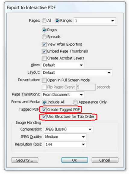
Using tags
Follow these guidelines when exporting InDesign files to PDFs.
- Always export the file with tags.
- Select Export, then select Save.
- Make sure the two Tagged PDF checkboxes for Create Tagged PDF and Use Structure for Tab Order are checked.
Universal Document Accessibility Principles
Universal Principles
Headings
One of the best ways to start creating more inclusive files using InDesign is to get into the habit of structuring your document using headings. It is tempting to just type your text and then change the size and boldness, but if you can get into the habit of using the Styles Pane to create your headings, you will make it a lot easier for people with disabilities to read your document.
Links
If your file contains links, use keywords in your content to create the hyperlink. In some cases, it is ok to hyperlink the URL, but keep in mind that a screen reader will read every character of that URL, so you'll need to have a compelling reason to do that. By hyperlinking the keyword or key phrase, people who use assistive technology will hear where the link will take them - and those who don't use assistive technology will see the emphasis on those key ideas. Avoid creating a hyperlink on words like "click here" because that is not descriptive enough. On the other hand, it is not necessary to hyperlink whole sentences or paragraphs.
If your hyperlink leads to a document like a PDF, be sure to include "PDF" in the hyperlink. Again, this lets all end users know what they're getting if they click on that link.
Images
If you're adding images to your file, make sure you include "alt text" or alternative text. This is a short, succinct description of the image that will be read to people using screen readers. Do not add alt text that contains the words "image of" or "photo of" - the description should be short, but give someone who can't see the image an idea of what is being communicated using the image. This takes practice and creativity, but it is very important so that everyone understands important information.
Color
The difference between your text color and the background color must be at least 4.5:1 in most cases. If your file is black text on a white background, you don't have to worry about color contrast. But if there are any other colors in your file that contain important information, you must check the color contrast.
Color must not be the only way to convey information. If text is important and the only way you signify that it is important is to change the text color - a person who is colorblind may not be able to perceive that change. Make sure there is at least one other way to distinguish the important information.